Smallwoods
// Redesigning the Customer Journey for Repair Services and Product Discovery
Timeline
Mar-May 2026
Tools
Figma, FigJam,
Google Forms, Excel
Role
UI/UX Design, Branding,
Research, Personas, User Flow, Wireframing, Prototyping, Usability Testing
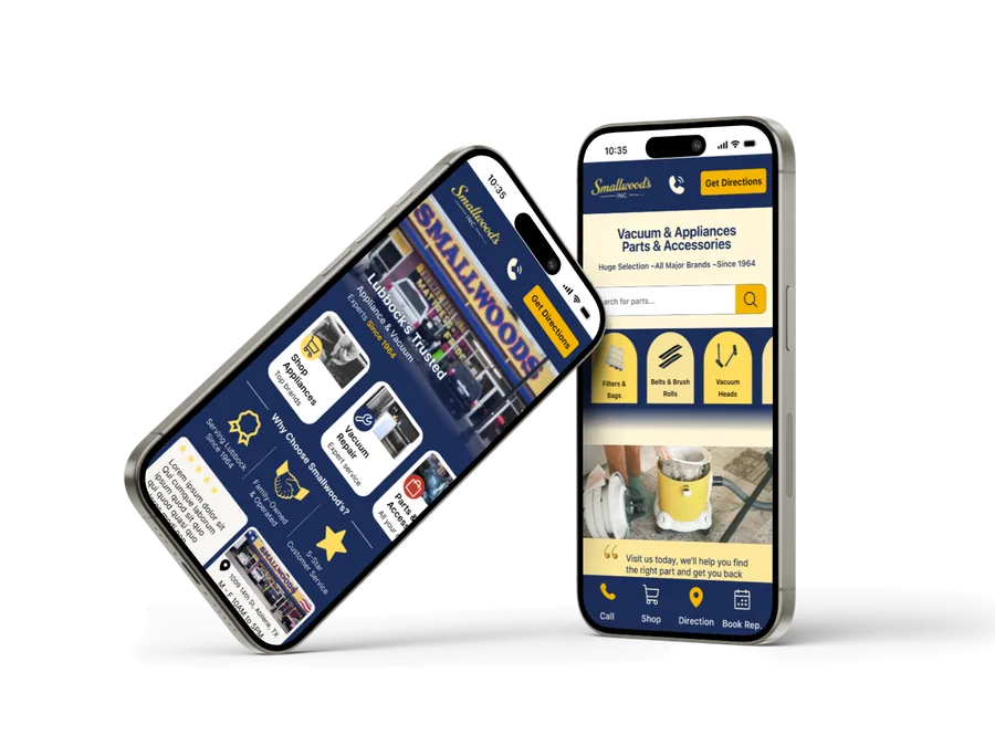
Project Overview
Problem
Users need a convenient way to locate repair services and related products in one place.
However, existing solutions often require users to search across multiple sources, making the process
time-consuming and less efficient.
As part of my UI/UX bootcamp, I designed the Smallwoods mobile app to improve how
customers discover repair services and browse available products.
The goal was to create a more
intuitive and user-friendly experience that makes it easier for users to find information, explore offerings,
and connect with service providers.
Solution
A user-centered mobile experience that makes it easier to find repair services,
explore products, and connect with providers. Clear navigation, structured content, and intuitive interactions
help users complete tasks with confidence.
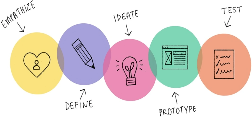
Design Process
I followed a user-centered design process to better understand user needs, define key
challenges, and develop effective solutions. Through research, ideation, design, and testing, I iteratively
refined the experience to create a product that balances user goals with business objectives.
Discover
User
Interviews
Empathy Map
Competitive Analysis
Define
Journey
Map
Personas
“How might we”
Ideate
User Flow
User
Journey
Crazy 8s
Design
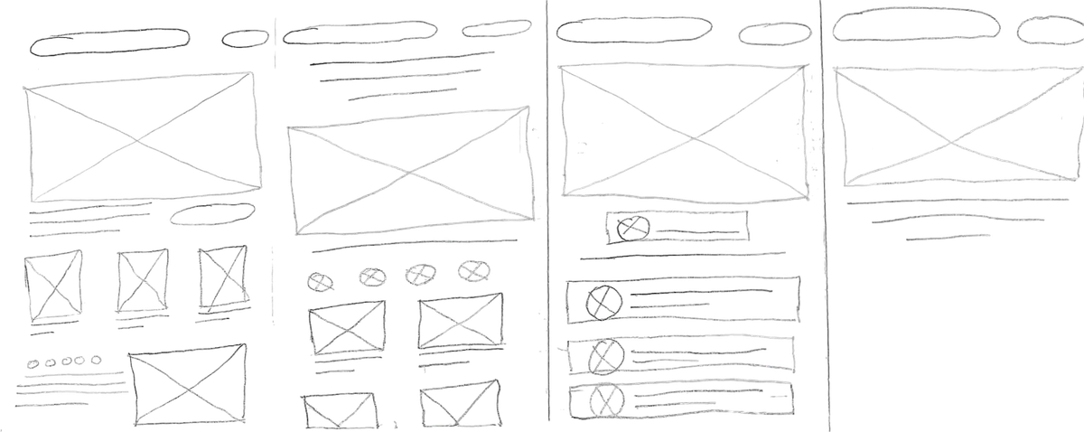
Wireframes
Visual Design
Test
Usability
Testing
Implementing Feedback
Discover Phase
The discovery phase focused on understanding how users look for repair services and
related products, as well as the challenges they face during this process. Through user research, I identified
key pain points, needs, and behaviors that informed the direction of the app design.
User interviews were conducted to gain deeper insights into how
individuals discover and choose repair services and related products. The goal was to understand user motivations,
pain points, and decision-making patterns, which helped identify key opportunities for improvement in the
experience.
- When something breaks, how do you usually decidewhether to repair it or replace it?
- What information do you look for first when visiting arepair shop’s website or listing?
- What would make you choose one repair shop overanother?
- How do you prefer to contact a business—phone, text,or online—and why?
- If you could design the perfect repair servicewebsite, what would it include or make easier for you?
- Time sensitivity stronglyinfluences decisions
- Users want upfront pricing or atleast a clear estimate range early
- Trust is built through reviews andvisible reputation signals
- Clear diagnosis transparency isexpected
- Easy booking and minimal frictionare essential
- Location and accessibility stillmatter, but convenience can override distance
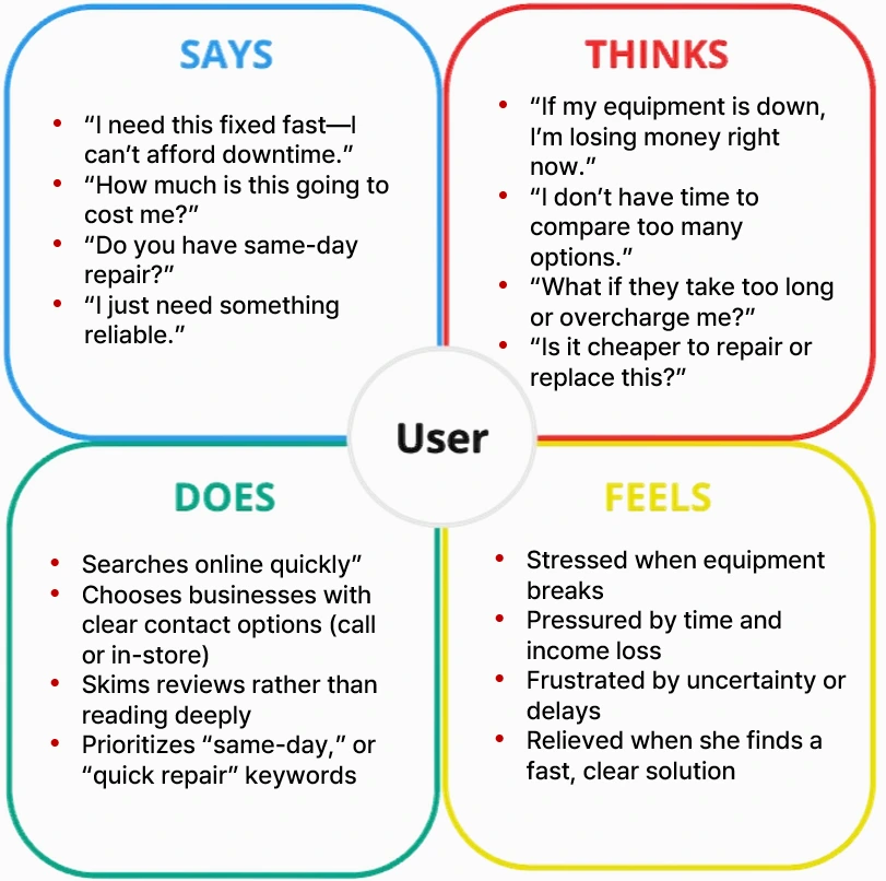
Empathy Map
I created an empathy map to synthesize user research findings and better understand
user thoughts, feelings, actions, and pain points when searching for repair services and products. This helped
translate qualitative insights into a clearer picture of the user experience.
Define Phase
In the define phase, I synthesized research findings from user interviews and the
empathy map to identify key user needs, pain points, and opportunities. This helped clarify the core problem and
set a clear direction for the design of the app.
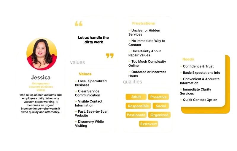
Persona
Based on insights from user research, I created a persona to represent the primary
users of the app. This persona highlights their goals, behaviors, frustrations, and needs when searching for
repair services and products, helping guide user-centered design decisions throughout the project.
After synthesizing research insights, I translated key user problems into How Might
We questions. These helped reframe challenges as opportunities and guided the ideation process for
improving how users discover repair services and products.
- How might we help users quickly find the repair services they need based on their specific problem?
- How might we improve the clarity of service and product information so users can make informed decisions?
- How might we reduce confusion when users are trying to understand which service or product best fits their
needs?
- How might we create a more intuitive navigation experience for users exploring services and products?
- How might we help users feel more confident and trust the services and products offered on the platform?
Ideate Phase
During the ideate phase, I explored multiple solutions based on the How Might We
questions and research insights. This phase focused on generating ideas to improve how users discover repair
services and products, and identifying opportunities to create a more intuitive and user-friendly experience.
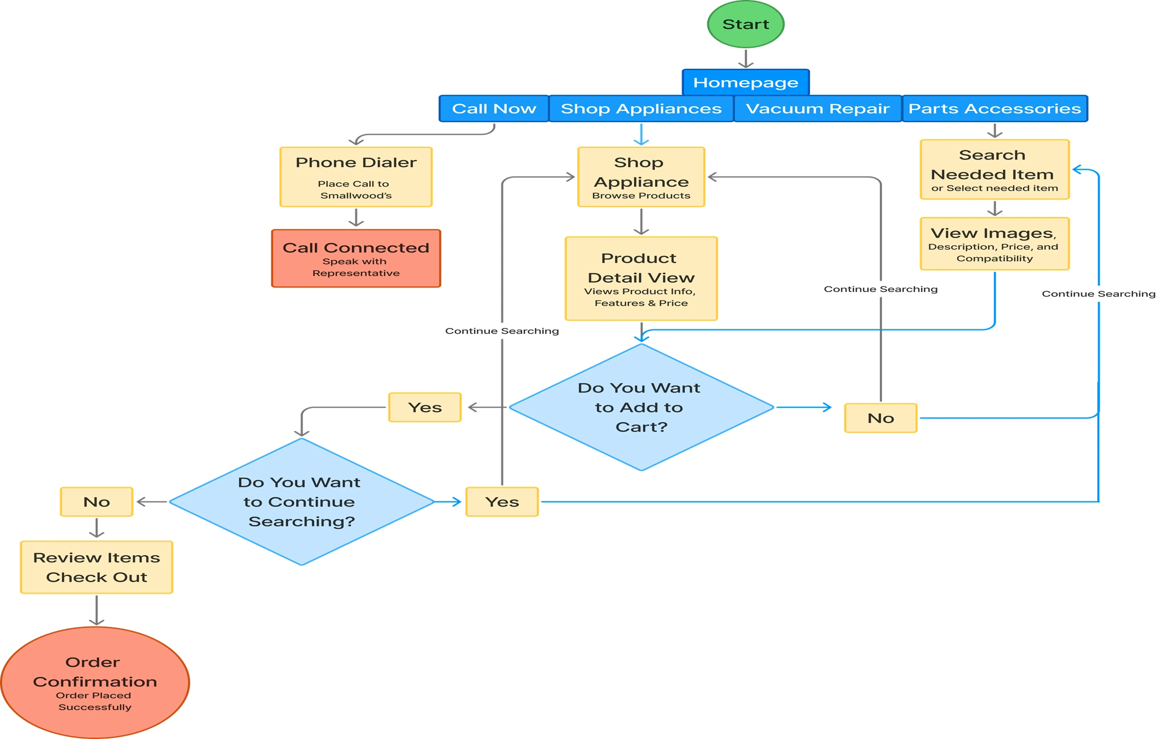
User Flow
It mapped the steps users take to complete tasks within the app. This process helped
identify opportunities to simplify navigation, improve usability, and create a smoother user experience.
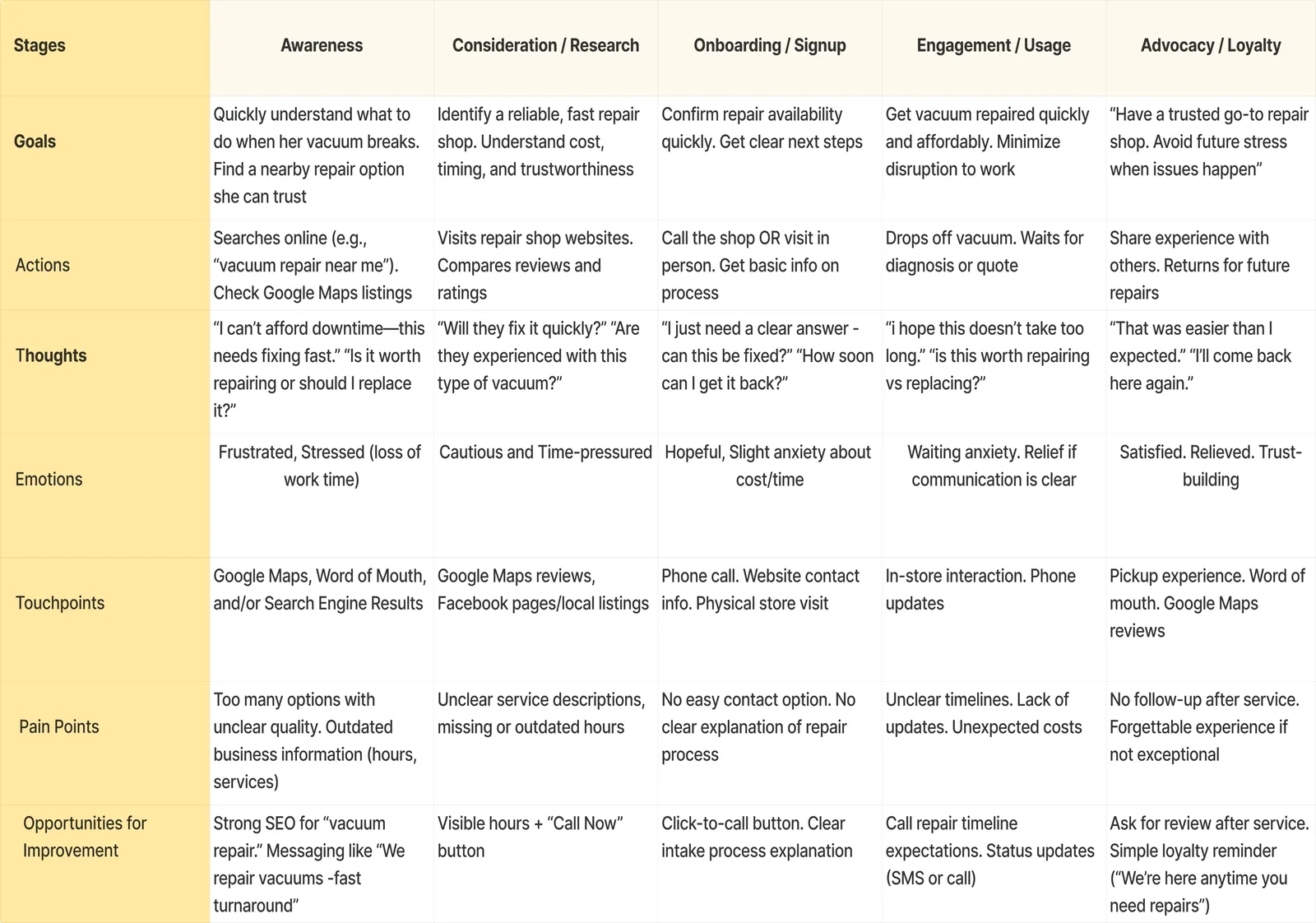
Journey Map
Based on research insights, I created a journey map to capture the end-to-end user
experience when searching for repair services and products. This exercise helped identify key pain points,
user needs, and opportunities that informed the design of a more intuitive solution.
Crazy 8s
Guided by research insights and How Might We questions, I used the Crazy 8s method to
brainstorm a range of solutions for improving service discovery, navigation, and product exploration. The
exercise helped uncover promising concepts that informed the final design.
Prototype Phase
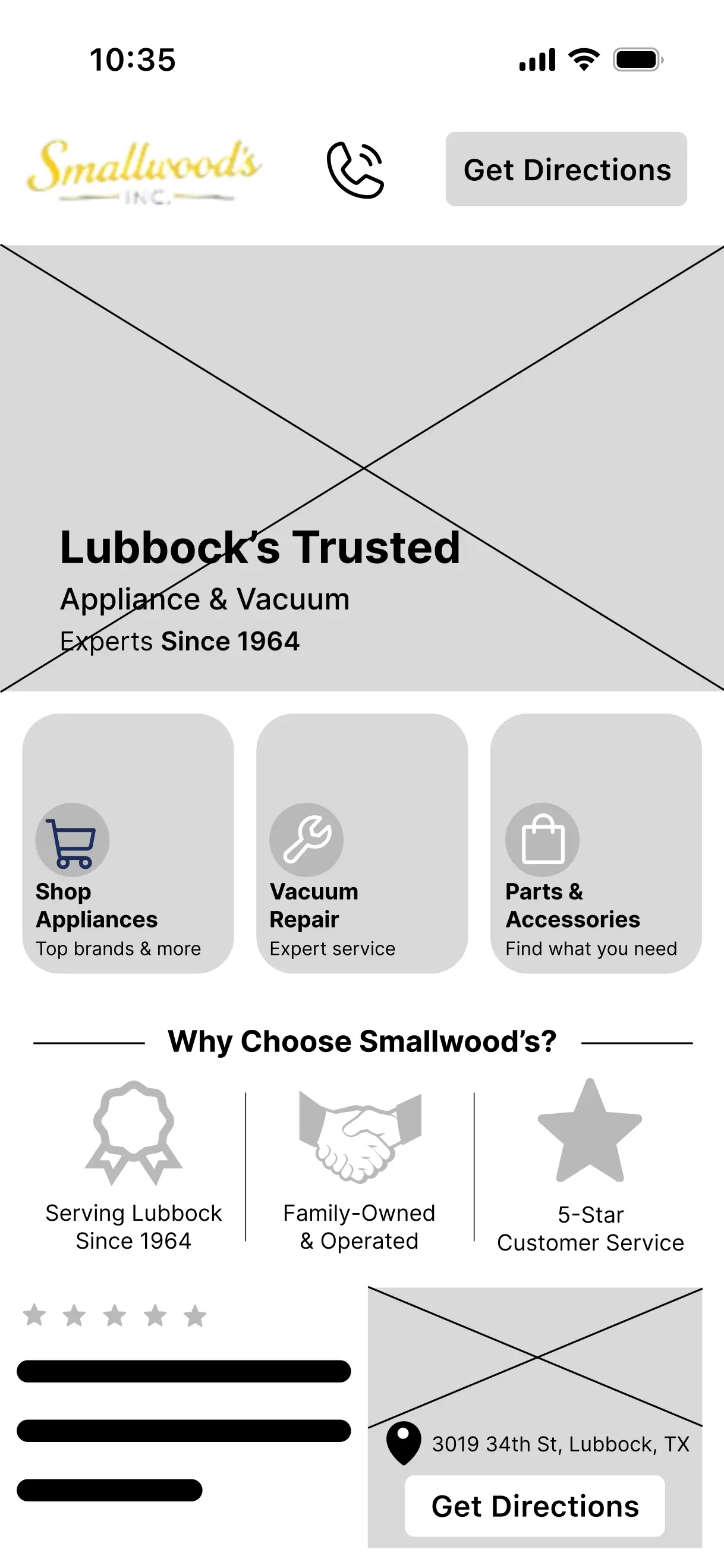
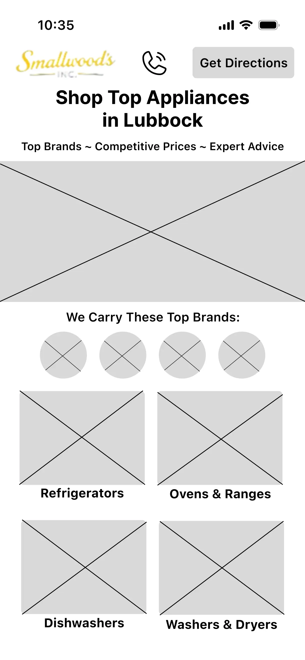
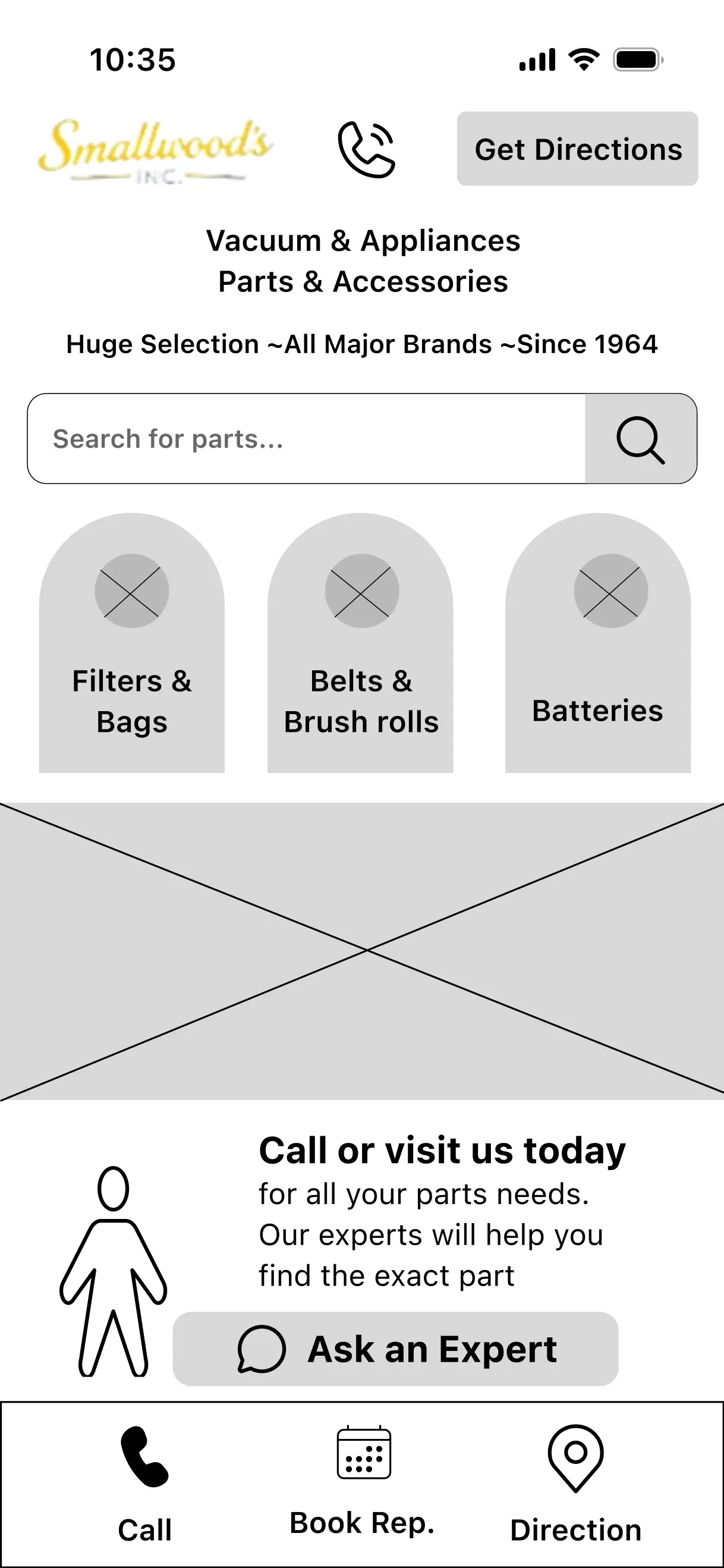
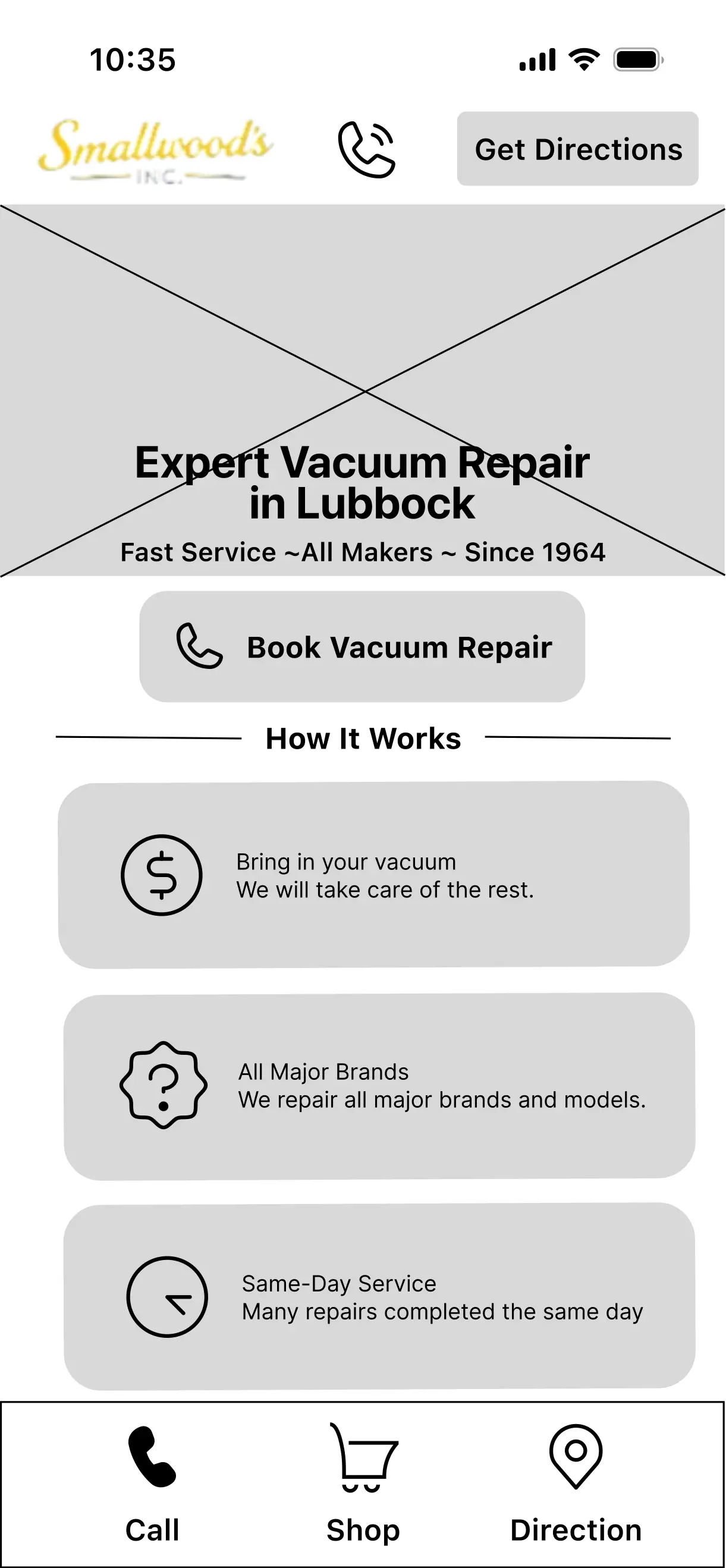
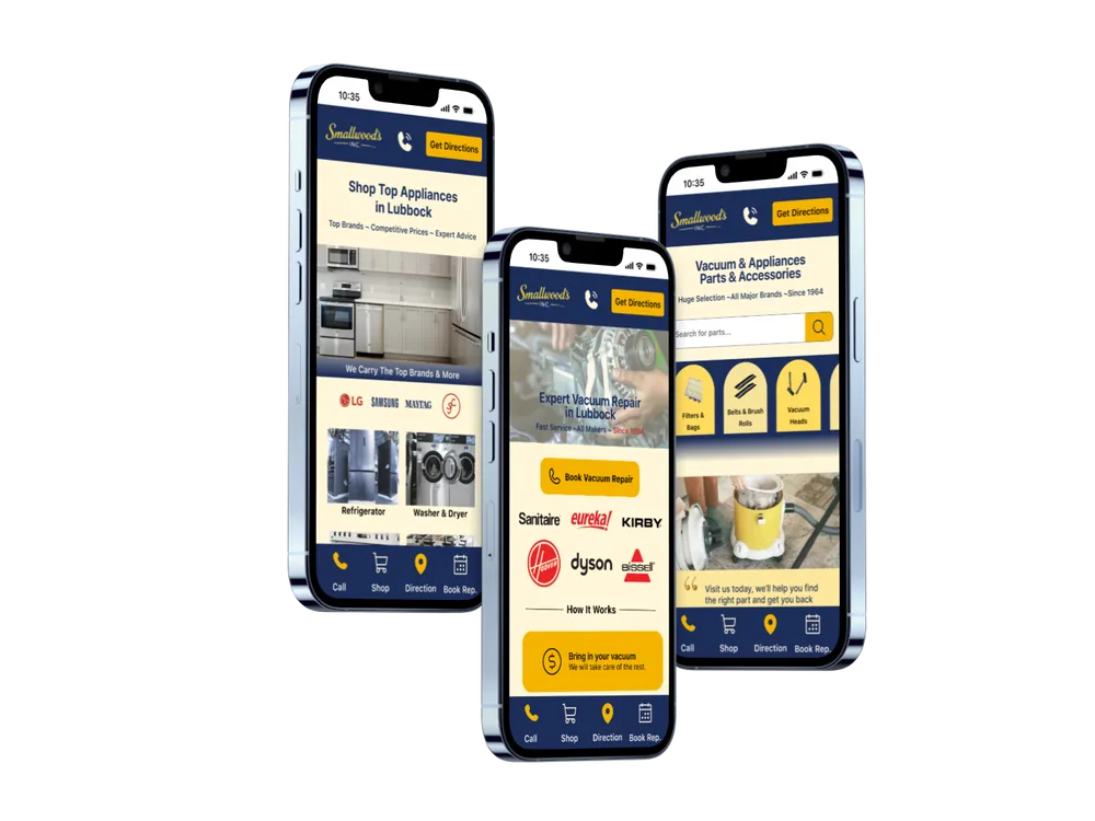
In the design phase, I transformed low-fidelity wireframes into high-fidelity screens
and interactive prototypes. This stage focused on improving visual hierarchy, usability, and consistency to
create a clear and intuitive experience for discovering repair services and products.
Testing Phase
During the testing phase, I evaluated the prototype with users to identify usability
issues and gather feedback on the overall experience. The insights collected helped validate design decisions
and uncover opportunities for improvement before finalizing the design.
Implementing Feedback
Implementing feedback after analyzing input from usability testing and stakeholders,
then applying it to improve the design and user experience.
Feedback gathered during testing revealed several areas where users felt the experience
could be improved. These recommendations helped identify usability issues and informed the design refinements
implemented in the final version.
- Making all vacuum parts easier to browse.
- Adding customer or technician reviews.
- Providing store information in a more visible location.
- Improving consistency across screens.
Based on feedback gathered during usability testing, I implemented several design
improvements to enhance navigation, increase information accessibility, and create a more consistent user
experience. These updates helped address user needs and refine the overall functionality of the app.
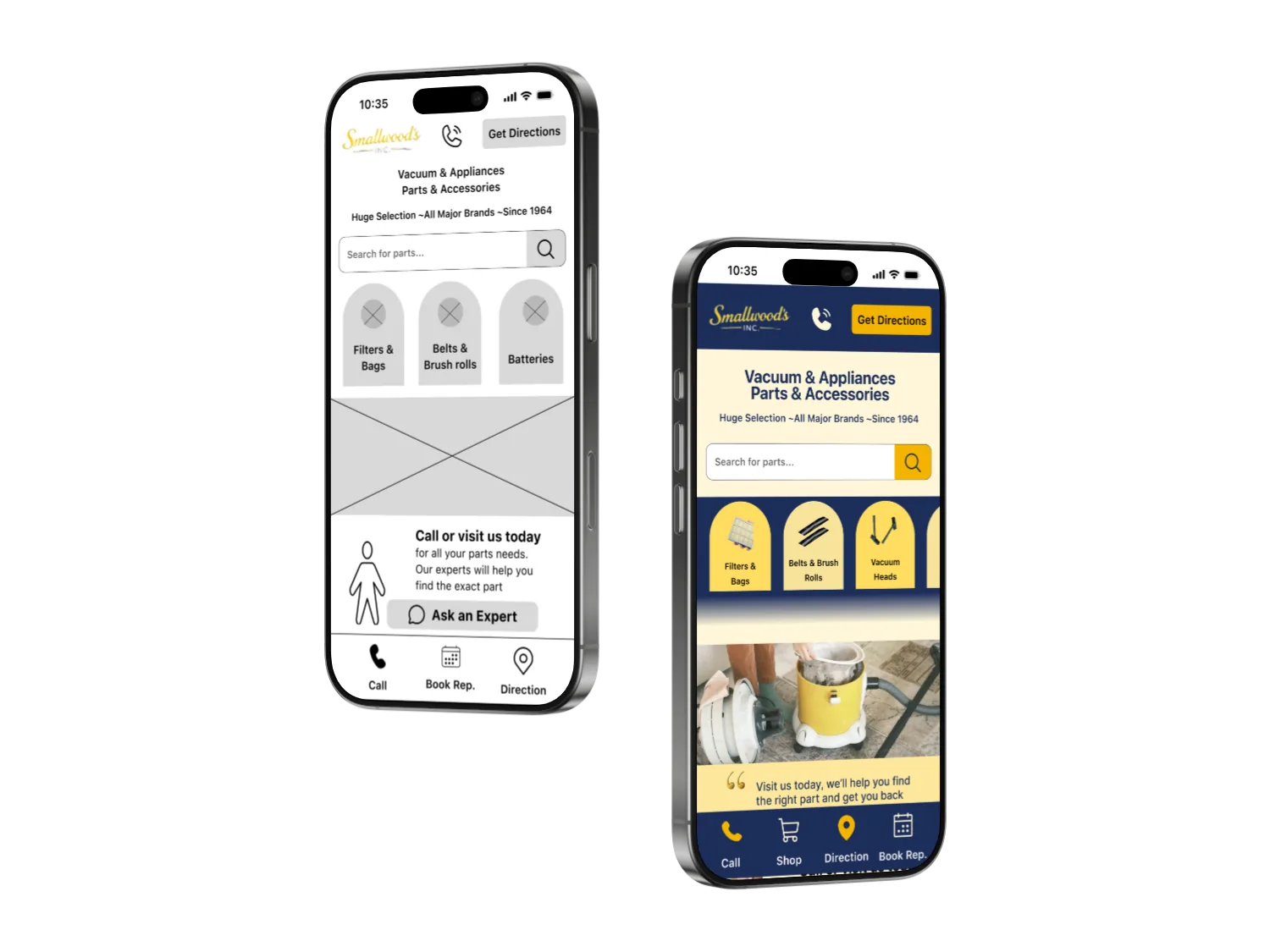
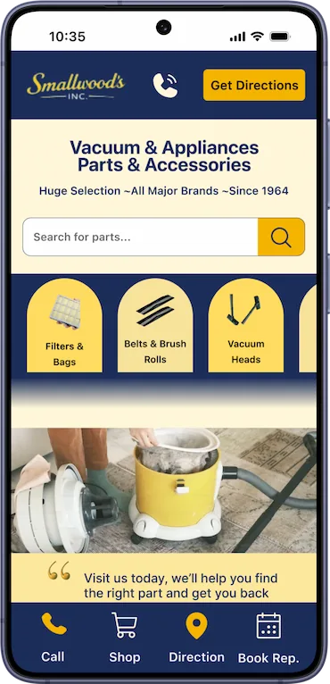
- Implemented a horizontal scrolling section to improve product discovery and browsing.
- Added technician reviews to provide users with valuable insights and increase confidence in their decisions.
- Moved store information to the home screen for easier access.
- Updated the footer to maintain consistency across all screens and improve navigation
Conclusion
This project demonstrated the value of user-centered design in creating a more
intuitive experience for discovering repair services and products. Through research, ideation, design, and
testing, I developed a solution that addressed user needs while improving navigation, accessibility, and overall
usability. The insights gained throughout the process reinforced the importance of validating design decisions
through user feedback and continuous iteration.