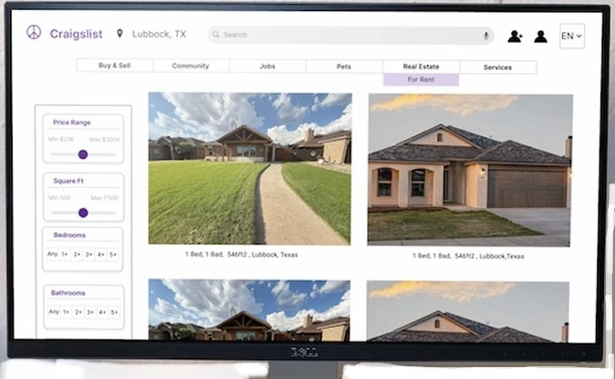
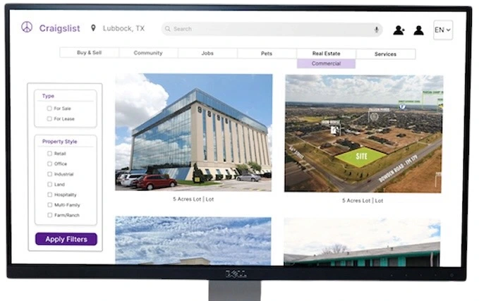
Craigslist Housing
// Redesigning the Housing Platform to Simplify Property Discovery
Timeline
Feb-Apr 2026
Tools
Figma, FigJam, Excel
Role
UI/UX Design, Branding,
Research, Personas, User Flow, Wireframing, Prototyping, Usability Testing
Project Overview
Problem
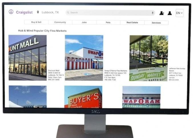
Craigslist’s housing section presents challenges for users due to cluttered listings,
inconsistent information, and limited filtering tools, making it difficult to efficiently search and compare
housing options, evaluate listings, and identify suitable housing within their budget and needs.
As part of my UI/UX bootcamp, I explored how finding housing on Craigslist can feel
overwhelming due to cluttered listings, inconsistent information, and limited filtering options.
This
project focuses on redesigning the housing search experience to make it easier for users to discover, compare,
and evaluate housing options efficiently.
Solution
This redesign focuses on improving the housing search experience by making it more
intuitive and structured. It introduces clearer filtering options, better-organized listing information, and a
stronger visual hierarchy to help users quickly find and compare housing options.
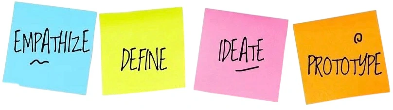
Design Process
The design process explores creative solutions based on user needs and pain points
identified during research. Its purpose is to create a simple, flexible, and easy-to-use user experience.
Discover
User
Interviews
Empathy Map
Competitive Analysis
Define
Journey
Map
Personas
“How might we”
Ideate
User Flow
Low-fi WF
Design
Wireframes
Visual
Design
Discover Phase
Before designing solutions, I conducted research to better understand how users search
for housing and the obstacles they encounter throughout the process. This phase helped uncover frustrations with
browsing, filtering, and evaluating listings, providing valuable insights to inform design decisions.
To move beyond assumptions, I conducted user interviews with individuals who
had experience searching for housing online. These conversations uncovered recurring pain points and user needs,
providing a clearer understanding of how the platform could better support users throughout their housing search
journey.
1. What websites or apps do you typically use when searching for housing,
and why?
2. What information is most important to you when evaluating a housing
listing?
3. What challenges or frustrations have you experienced while searching for housing
online?
4. How do you compare multiple housing options before making a decision?
5. If you could improve one thing about your housing search experience, what would it be and
why?
Key Insights of the interviews needs
• Search Efficiency
•
Information Consistency
• Visual Content
• Property Comparison
• Key Information Visibility
• Trust
& Credibility
Empathy Map
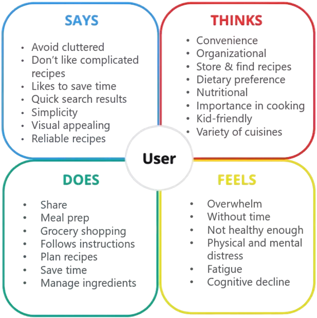
Using insights gathered from user interviews, I developed an empathy map to visualize
users' experiences when searching for housing online. By organizing what users said, thought, did, and
felt, I gained a deeper understanding of their motivations, frustrations, and goals, helping guide a more
user-centered redesign.
Define Phase
To better understand and empathize with the target audience, I created a persona based
on recurring patterns identified during user research. This tool helped translate research insights into a
relatable user profile and guided the development of user-centered solutions.
Persona
Research revealed two key user groups: people searching for housing and property
managers responsible for listing properties. By creating personas for each group, I was able to better
understand their goals, frustrations, and expectations, helping ensure a balanced and user-centered redesign.
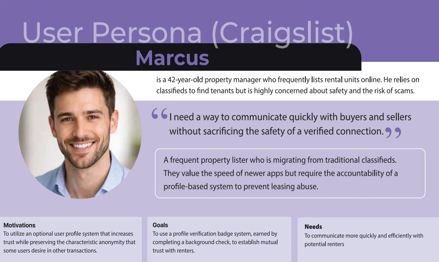
Created an intuitive, efficient digital platforms that streamline complex operational
tasks, reducing manual effort and errors for property managers while improving tenant satisfaction.
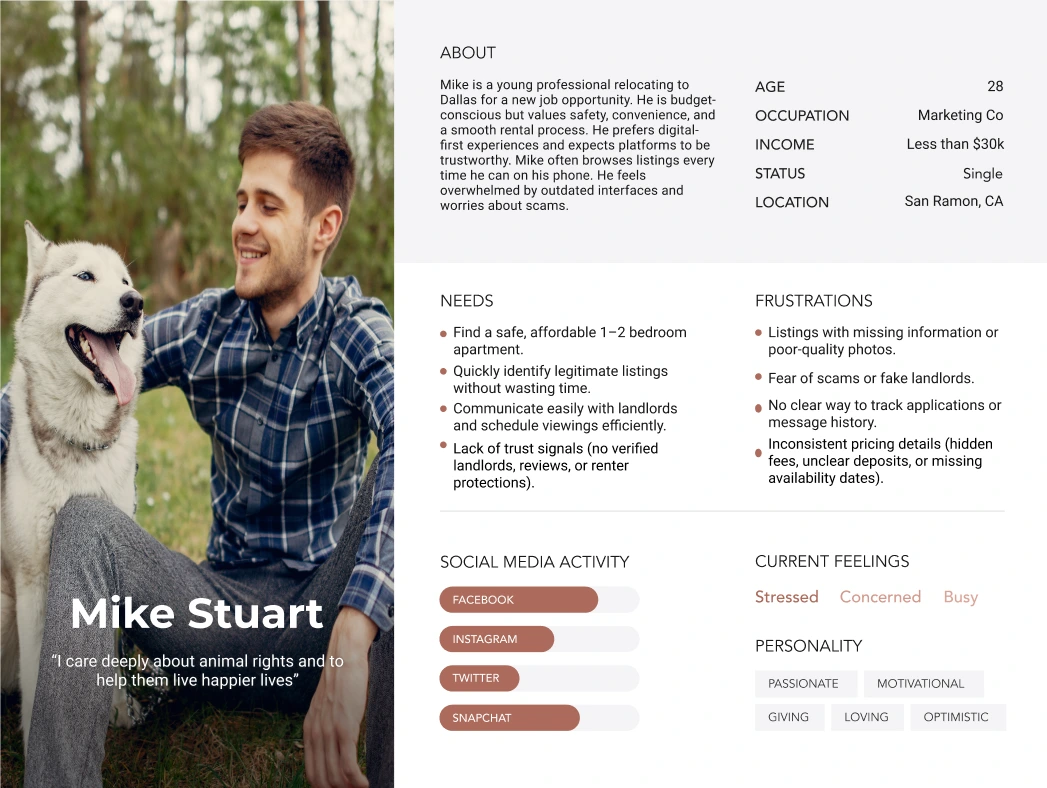
With the date collected and AI assistance, Mike’s info was created representing the
ideal user of the application. The purpose is to have an in-depth understanding of the user's goals and
frustrations.
After defining the problem and identifying key user needs, I translated research insights
into How Might We questions. These questions helped reframe user challenges as opportunities for
design and guided the ideation of potential solutions.
1. How might we help users quickly find housing listings that match their
needs and preferences?
2. How might we make it easier for users to compare multiple properties
during their search?
3. How might we present listing information in a clearer and more
consistent way?
4. How might we help users evaluate listings with greater confidence and
trust?
Ideate Phase
The ideate phase focused on generating and evaluating potential solutions based on
research insights. By exploring different concepts and features, I identified opportunities to create a more
intuitive and efficient housing search experience.
User Flow
Based on research insights, I developed a user flow to outline how property managers
and users navigate the platform when posting and searching for housing
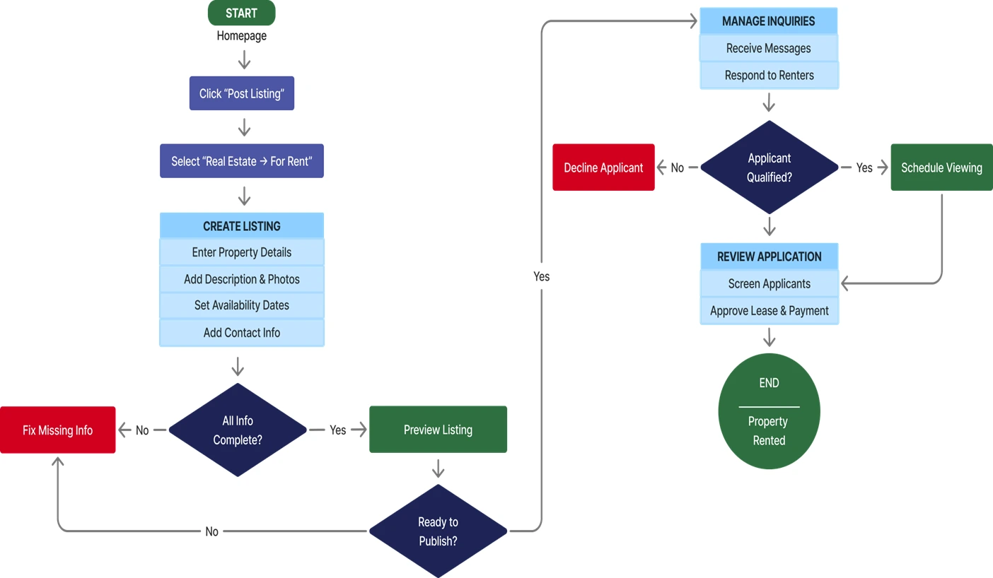
Created in Figma, this user flow visualizes the steps property
managers take to manage listings and evaluate potential applicants or buyers. It helped identify key
decision points and informed the design of a more efficient management experience.
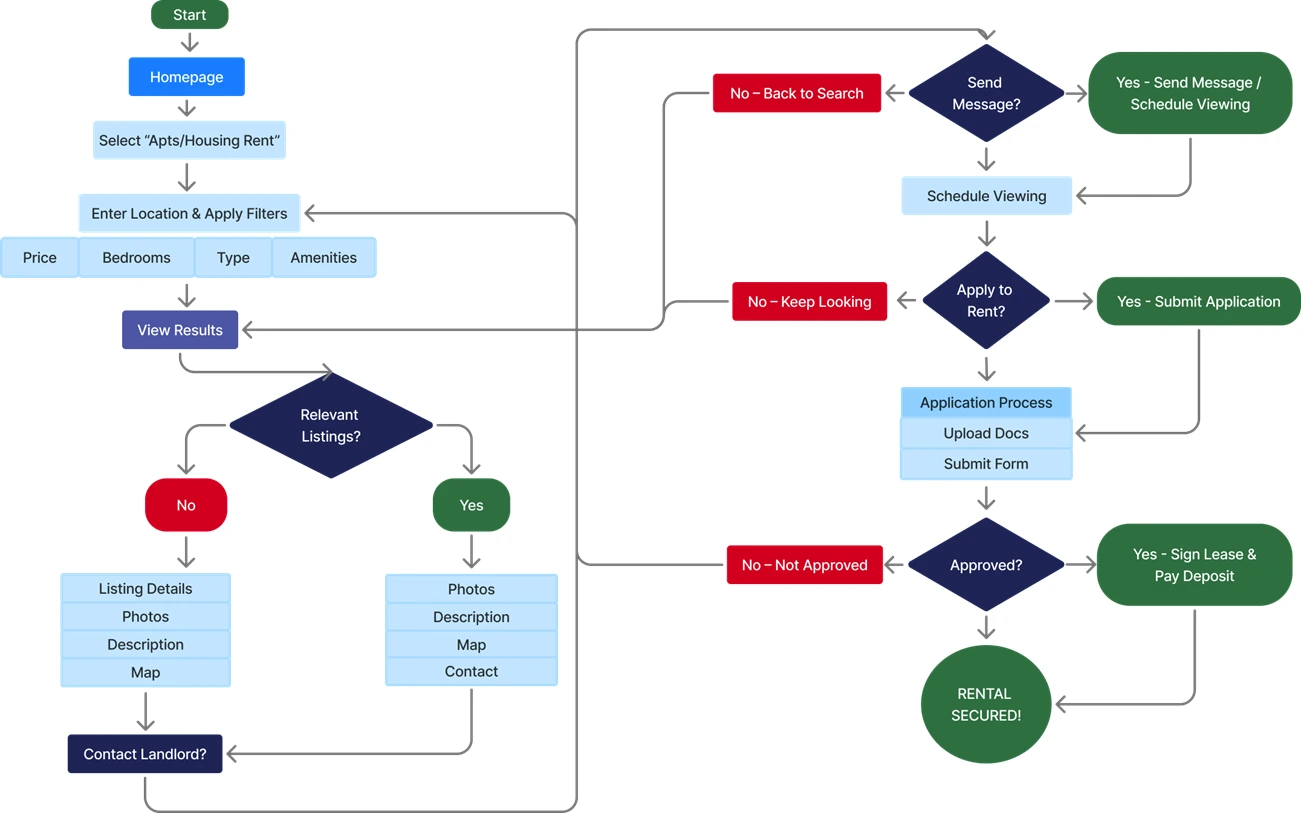
This user flow is created to visualize the steps users
take to search, filter, and evaluate housing listings. This flow helped identify key interactions and
opportunities to improve the property discovery experience.
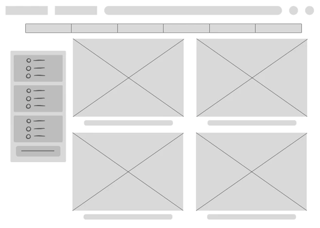
Low Fidelity Wireframe
Created in Figma, these low-fidelity wireframes helped define the platform's
layout, navigation, and core functionality for both housing seekers and property managers. This stage focused on
usability and information architecture rather than visual design.
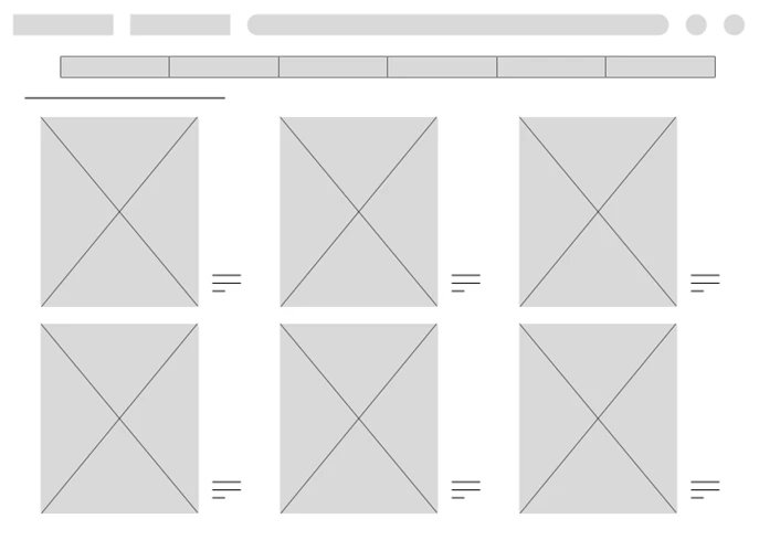
Homepage
Real Estate Category
Prototype Phase
Building on the foundation established during ideation, I developed high-fidelity
designs and interactive prototypes for both housing seekers and property managers. This phase focused on
creating intuitive interfaces, improving usability, and ensuring a consistent experience across the platform.
Conclusion
- Users rely on filtering and organization tools to efficiently navigate large numbers of housing listings.
- Clear and consistent property information helps users compare options and make informed decisions.
- Thoughtful visual hierarchy reduces cognitive load and improves discoverability.
- Property managers need streamlined workflows to efficiently create, manage, and review listings.
- Designing for both housing seekers and property managers reinforced the importance of balancing the needs
of multiple user groups.
This project reinforced the importance of validating design decisions through research and designing for the
needs of multiple user groups. I learned how user insights can shape more effective solutions and how
information architecture, filtering, and visual hierarchy can improve complex experiences. Balancing the goals
of both housing seekers and property managers also strengthened my ability to create user-centered solutions
that support different needs within the same platform.