TasteBook
// End-to-End User Research and Design for a Digital Cookbook
Timeline
Sep-Nov 2025
Tools
Figma, FigJam, Google
Forms, Excel
Role
UI/UX Design, Branding,
Research, Personas, User Flow, Wireframing, Prototyping, Usability Testing
Project Overview
Problem
Users often struggle to decide what to cook at home due to limited time, low energy, and
lack of basic cooking skills, resulting in reliance on unhealthy or repetitive meal choices.
As part of my UI/UX bootcamp, I designed TasteBook, a recipe discovery app focused on
helping users cook with leftover ingredients.
The goal is to reduce food waste while making it easier
for beginner cooks to decide what to prepare with what they already have.
Solution
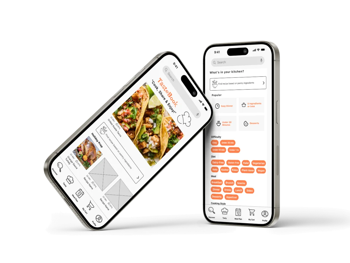
A digital cookbook app that helps users decide what to cook using ingredients they
already have at home. It offers simple recipe instructions, flexible portion sizes, and dietary options to
make everyday cooking easier, more affordable, and more enjoyable.
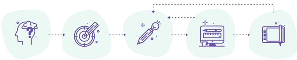
Design Process
The design process explores creative solutions based on user needs and pain points
identified during research. Its purpose is to create a simple, flexible, and easy-to-use user experience.
Discover
User Interviews
Surveys
Empathy
Map
Competitive Analysis
Define
Journey Map
Personas
“How might
we”
Ideate
User Flow
Card
Sorting
Crazy 8’s
Design
Wireframes
Visual Design
Test
Usability Testing
Implementing
Feedback
Discover Phase
It transformed research findings into actionable insights by uncovering the key
challenges users experience when planning meals and cooking at home. These insights informed design decisions
and helped shape a solution that is more accessible, flexible, and aligned with user needs.
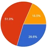
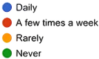
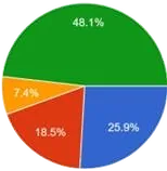
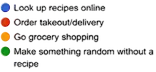
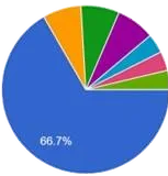
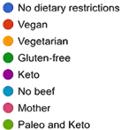
A survey was conducted to gather quantitative data about users' cooking
habits, meal-planning behaviors, and challenges. The findings helped identify recurring patterns and validate
assumptions about the problem space. The followed results were obtained:
Key Insights of the Survey
• Cook frequency
• Dietary
preferences
• Inspirational recipes
• Find recipes of random left ingredients
User interviews were conducted to explore the motivations, frustrations, and
behaviors behind meal planning and home cooking. The insights revealed opportunities to better support users in
making cooking decisions and reducing food waste.
1. How often do you cook?
2. How do you usually decide
what to cook?
3. Have you ever tried to find a recipe based on ingredients you already had at
home
Key Insights of the interview needs
• Provide directions to cook
•
Add simple & easy recipes
• Include meal planning features
• Understanduser’s needs
• Providea clean
and intuitive interface
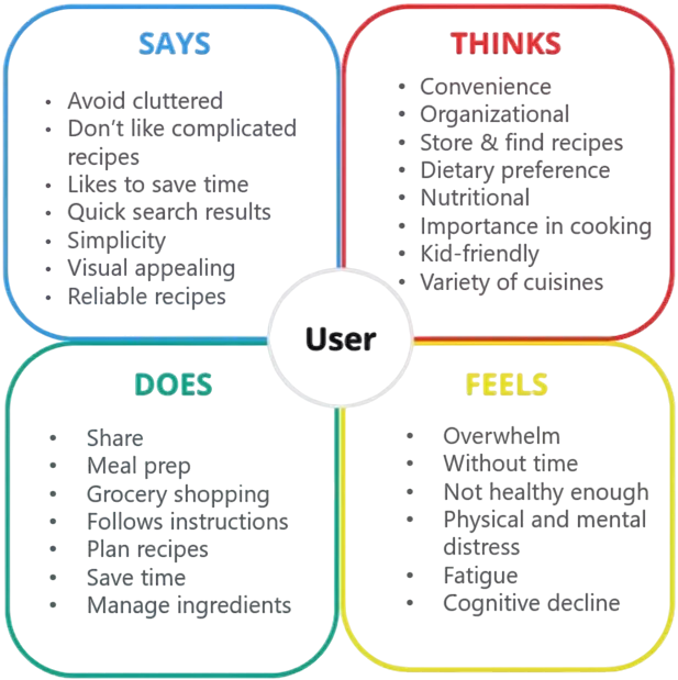
Empathy Map
It was created to better understand the user’s needs, emotions, and pain points
throughout their cooking experience. These insights helped identify opportunities to improve usability and
overall satisfaction.
Define Phase
The research insights were analyzed to uncover user pain points, clarify goals, and
establish a focused problem statement that guided the design process.
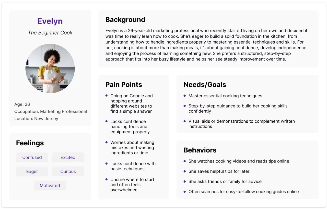
Persona
By creating a user persona, I gained insights into the actual users’ needs, goals, and
frustrations. Through empathy, I can provide a more meaningful user experience. The objective is to find
solutions to address the users’ needs and pain points, based on the user persona that has been created.
Based on the research findings, I translated key user needs and pain points into How
Might We questions. These questions helped reframe challenges as opportunities and guided the ideation
process toward meaningful design solutions.
1. How might we help users quickly discover recipes based on ingredients
they already have at home?
2. How might we reduce food waste by encouraging users to make use
of leftover ingredients?
3. How might we make meal planning easier for users with limited time
and energy?
Ideate Phase
It focused on turning research findings into potential design solutions. This process
encouraged creative thinking to develop a more intuitive and user-centered experience.
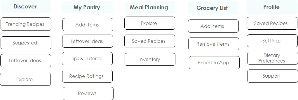
Card Sorting
It was used to better understand how users organize and categorize information. The
findings helped create a more user-friendly structure and improve the overall navigation experience.
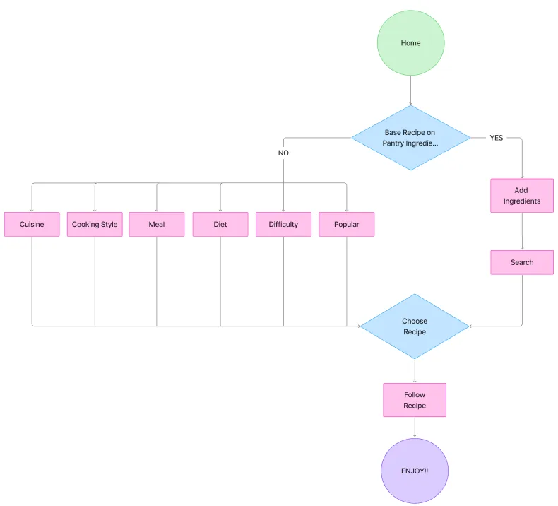
User Flow
It mapped the steps users take to complete tasks within the app. This process helped
identify opportunities to simplify navigation, improve usability, and create a smoother user experience.
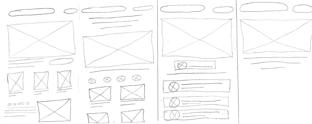
Crazy8's
An ideation technique used early in the design process to quickly explore multiple
ideas, moving beyond the first solution before refining the strongest ones.
Prototype Phase
Design is a problem-solving process that combines understanding users’ needs with
creating thoughtful and functional experiences that are useful, clear, and enjoyable for people.
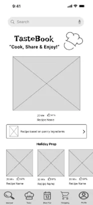
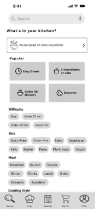
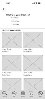
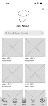
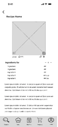
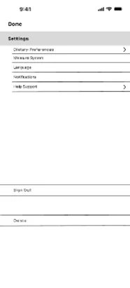
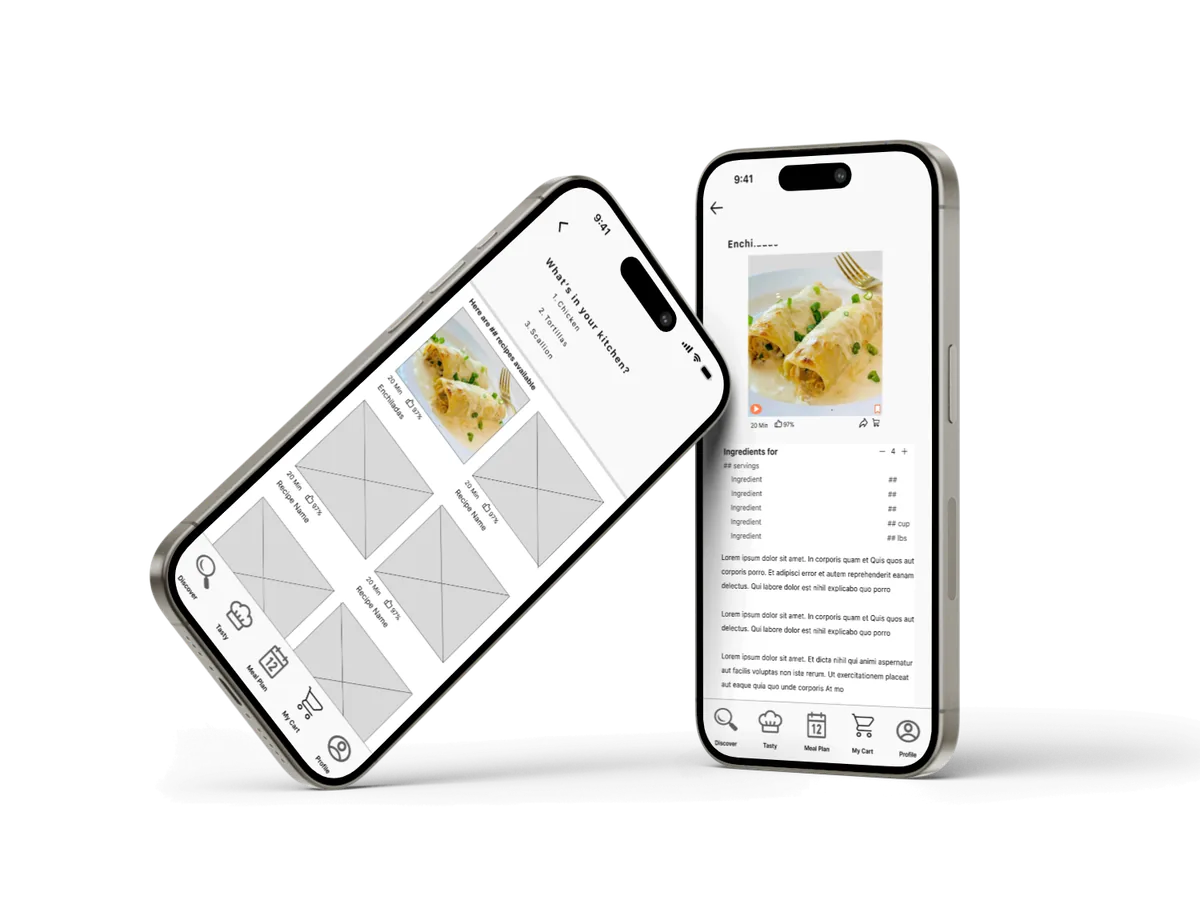
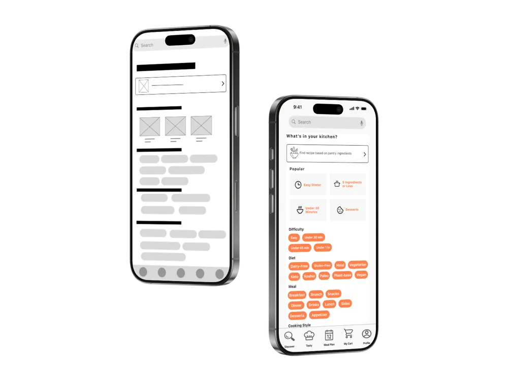
Mid-Fidelity Wireframe
It shows layout and content structure with more detail, but without final visuals or
styling.
Testing Phase
The test phase involves observing real users interacting with a product to uncover
problems, validate design decisions, and refine the solution.
Usability Testing
To better understand user needs, I collected
feedback from participants as they completed key tasks within the prototype. Their observations and suggestions
provided valuable insights that guided the next design iterations.
- Maintain dark text colors for recipe information to improve readability and accessibility.
- Simplify the search section to reduce visual clutter and make recipe discovery more intuitive.
- Provide additional information within the Meal Plan and Shopping List features to better support meal
preparation and grocery planning.
Implementing Feedback
User feedback played a key role in the final iteration of the design. By analyzing
participant suggestions, I implemented improvements that increased accessibility, simplified navigation, and
strengthened the functionality of key features.
Divider lines were removed
to minimize visual clutter and create more breathing room between frames, improving overall readability.
Conclusion
TasteBook addresses the challenge of everyday meal planning by helping users make the
most of what they already have at home. The final design streamlines recipe discovery, reduces decision fatigue,
and supports more sustainable cooking habits. This project demonstrated how user-centered design can turn a
simple idea into a practical, everyday solution.